A Bowtie diagram is a visual risk assessment tool that illustrates the pathways from potential accident causes to the resulting consequences, and the controls (barriers) in place to prevent or mitigate those pathways. It gets its name from its shape: the diagram has a central “knot” representing a hazardous Top Event (e.g., a loss of containment or equipment failure), with causes depicted on the left side and consequences on the right, resembling a bow-tie. Each cause is connected to the top event by a Threat line, and along that line are preventive barriers intended to stop the cause from triggering the top event. Similarly, on the right side, each consequence has mitigating barriers to reduce its severity. This format creates one, easy-to-understand picture of a risk scenario. The left side focuses on proactive risk management (preventing the incident), while the right side focuses on reactive measures (limiting damage if it occurs). The power of the bowtie method is that it provides an overview of multiple credible scenarios and their safeguards in a single diagram, making complex risk information accessible at a glance.
Bowtie diagrams are especially useful for major accident hazards – situations with potentially severe outcomes (like fires, explosions, toxic releases) that require multiple layers of protection. They originated in high-risk industries (oil and gas, aviation, etc.) and are now used across sectors to communicate risk to both technical and non-technical stakeholders. By laying out causes, controls, and consequences, a bowtie helps identify weaknesses: for instance, a cause that has no prevention barrier, or a consequence with insufficient mitigation, stands out visually. OSVARD uses bowtie analysis to complement quantitative risk assessments by providing a qualitative, structured visualization. Many regulators and corporate risk policies in Asia encourage the use of bowties as part of safety cases or risk management systems because they clearly show how risks are being managed. In practice, developing a bowtie diagram often follows from earlier analyses (like HAZID or HAZOP) – once hazards are identified, the bowtie format is used to organize the information. For example, if a Top Event is “Gas leak in reactor”, causes might include “Seal failure” or “Operator error,” and preventive barriers could be things like “Routine maintenance of seals” or “Gas detectors with alarm”. On the consequence side, outcomes might include “Fire/Explosion” or “Toxic exposure,” with mitigation like “Fire suppression system” or “Emergency ventilation.” Bowties thereby ensure no critical safeguard is overlooked and that responsibility for each barrier is assigned and understood.
OSVARD assists companies in developing clear and informative bowtie diagrams as part of their risk management and process safety programs. Our consultants will lead workshops with your team to define the hazard under consideration (the Top Event) and systematically identify all credible threats (causes) and consequences. We then help map existing controls onto the diagram – noting which barriers prevent the incident and which mitigate it. Thanks to our formal, methodical approach, we often uncover gaps, such as a missing barrier or a reliance on a single control where multiple layers would be safer. OSVARD ensures that each barrier is described in practical terms (e.g., “Automated shutdown on high pressure” rather than just “Instrumentation”) so that its effectiveness can be evaluated. We also consider escalation factors: conditions that could cause a barrier to fail (for instance, a fire water pump not starting due to maintenance issues) and suggest safeguards for those factors as well. The end product is a professional bowtie diagram (often created with specialized software) that can be included in safety reports, training materials, and management reviews. It serves as a living risk management tool – easy to update as processes change or new lessons are learned. By engaging OSVARD, Asian businesses gain not just a diagram, but a deeper shared understanding of their major risks and how those risks are controlled. This enhances communication from the frontline workforce to executives, aligning everyone on critical safety barriers and responsibilities.
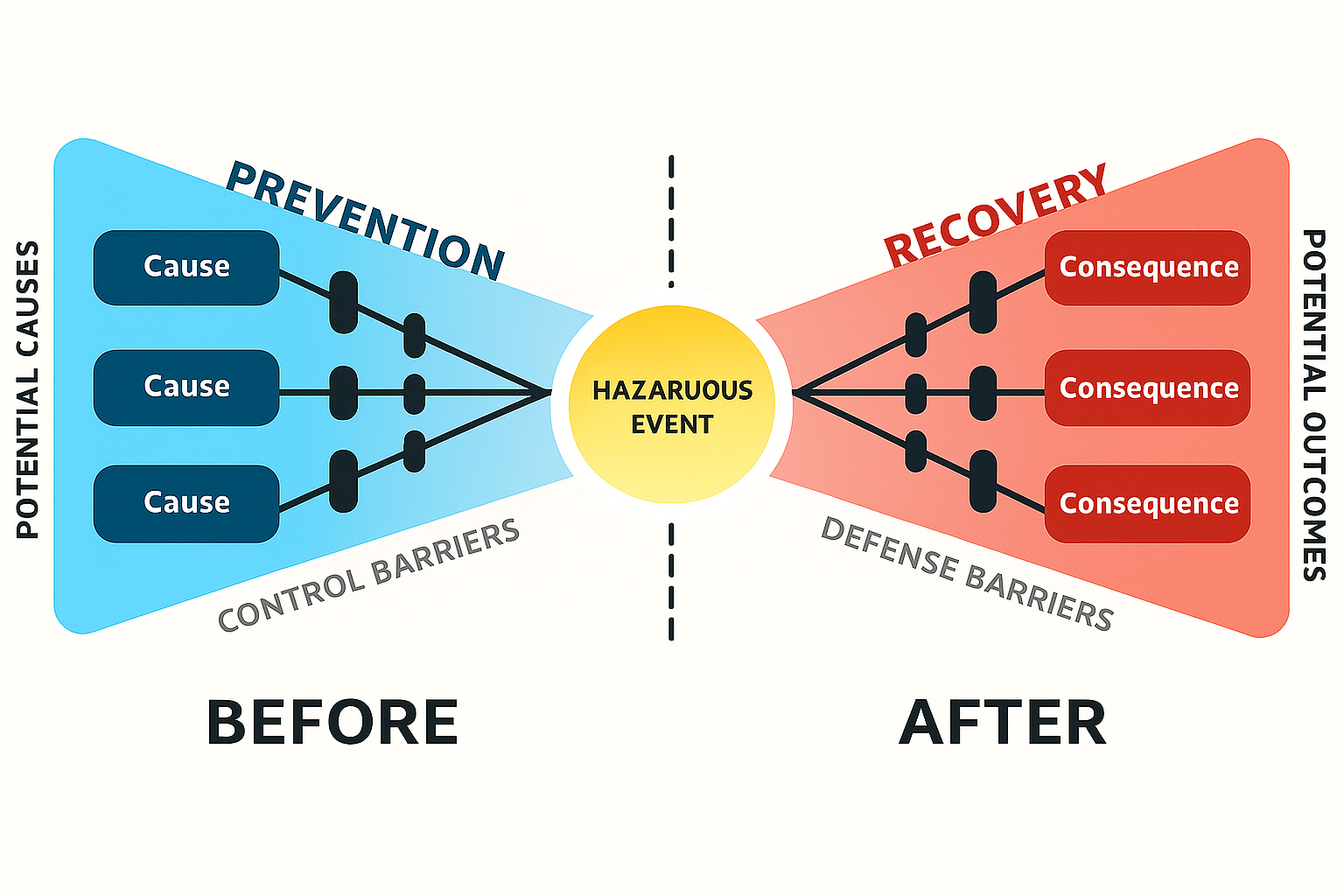
Wolters Kluwer (Enablon) – A bowtie diagram visualizes a risk in one picture, clearly separating proactive (preventive) and reactive (mitigative) risk management measureswolterskluwer.com.
Wolters Kluwer (Enablon) – Bowtie provides an overview of multiple scenarios in a simple visual explanation that would be hard to communicate otherwisewolterskluwer.com.
Finch Consulting – Bowtie diagrams display major accident hazards, showing initiating causes on the left with preventive barriers, and consequences on the right with mitigation barriersfinch-consulting.comfinch-consulting.com.